The Royal Decree of 1393 and the Era of Illiteracy
In the year 1393, King Richard II of England enacted an extraordinary law that required all brewers and sellers of ale to hang a visible sign or banner on the facade of their establishments ("Whosoever shall brew ale in the town with intent to sell it shall hang out a sign").
-
The reason for the law: To allow royal drink inspectors (ale-conners) to identify and regulate the quality and purity of the ale sold in each public house.
-
The graphic solution for an illiterate population: Since the vast majority of the medieval population could not read, the signs did not contain text. Clear and symbolic illustrations were used: a red lion (The Red Lion), a crown (The Crown), or a white swan (The White Swan). In this way, any traveler could say: "We are at the door of the Red Lion."
Vintage Typography and the Aesthetics of Gold Leaf
Over the centuries and with the arrival of the Georgian and Victorian eras in the 19th century, the pub sign became a form of high-precision artisanal art:
-
Gold Leaf Glazing: Use of thin sheets of 22-carat gold applied to the back of glass to create bright letters that reflected the light from street gas lamps.
-
Serif and Roman Typefaces: Designs of bold and robust letters that conveyed solidity, reputation, and commercial elegance.
-
Oil Paint on Oak Wood: Capable of withstanding the elements, rain, and smoke from industrial metropolises.
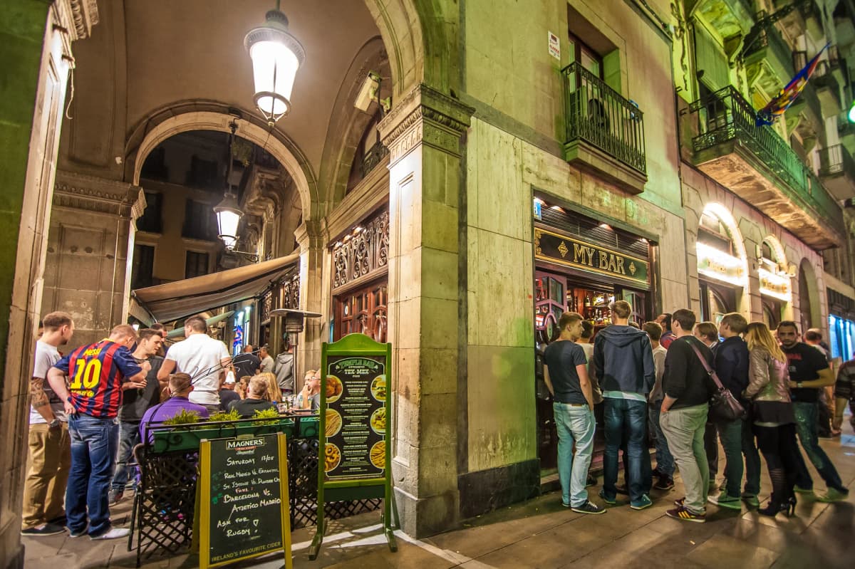
Visual Authenticity in the Heart of Barcelona
The value of vintage aesthetics does not lie in accumulating old objects, but in recovering the visual dignity of artisanal work. In a world dominated by synthetic neon signs and mass-produced industrial design, the warmth of carved wood and classic lettering connects with the emotional memory of the visitor.
At MY BAR, respect for this traditional iconography is felt in every corner. Our space in the Gothic Quarter pays homage to the elegance of yesteryear's taverns, creating a visually rich, authentic environment with its own personality in the heart of Barcelona.
Discover a space with true personality and history.
Sources